
/
February 17, 2025
/
By :
7 Tips for WooCommerce Mobile Optimization
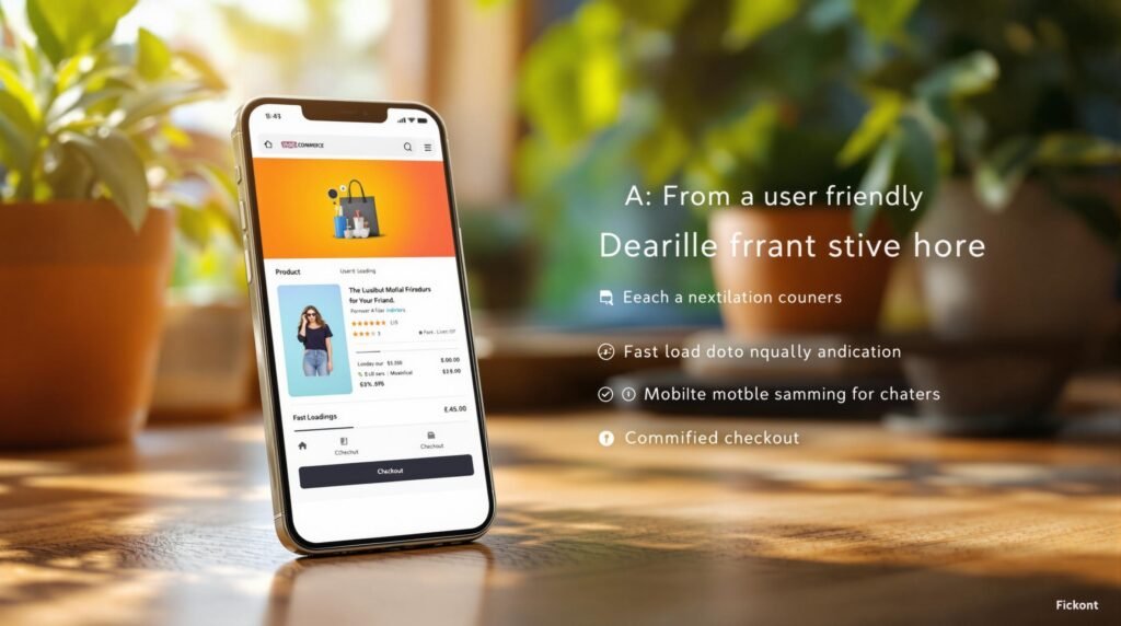
Mobile shopping is expected to account for 72.9% of all e-commerce sales by 2025. If your WooCommerce store isn’t optimized for mobile, you risk losing potential customers due to slow load times, poor navigation, or frustrating checkout processes. Here’s how to fix that:
Key Strategies for Mobile Optimization:
Choose a Mobile-Ready Theme: Use themes like Astra or Storefront for fast load times and responsive designs.
Speed Up Your Store: Implement caching (e.g., WP Rocket), use a CDN, and optimize images with formats like WebP.
Simplify Navigation: Add intuitive menus, sticky headers, and autocomplete search functionality.
Streamline Checkout: Use single-page checkouts and offer mobile payment options like Apple Pay and Google Pay.
Add Mobile-Only Features: Use push notifications and floating action buttons to improve engagement.
Fix Common Issues: Avoid intrusive pop-ups, remove unused code, and reduce loading times to under 3 seconds.
Work with Experts: If needed, hire professionals to maintain and enhance your mobile site.
Quick Comparison Table:
How to Speed Up Your WooCommerce Store on WordPress
1. Pick the Right Mobile-Ready WooCommerce Theme
The first step in mobile optimization is choosing a theme that enhances mobile performance through fast load times and easy usability.
Key Features for a Mobile-Friendly Theme
Here’s what to look for in a WooCommerce theme designed for mobile users:
Top WooCommerce Themes for Mobile
Here are some of the best themes to enhance mobile usability:
Astra:
Ultra-lightweight (under 50KB) with load times of 1.8 seconds and 95+ PageSpeed scores.
Includes customizable mobile headers for better navigation.
Storefront:
Built specifically for WooCommerce with load speeds around 2.1 seconds.
Features a mobile-first design approach and automatic layout adjustments.
Offers a drag-and-drop builder tailored for mobile.
Includes touch-optimized product galleries and loads in approximately 2.3 seconds.
These themes focus on three key areas: speed (through lightweight coding), usability (with touch-friendly designs), and conversions (via mobile payment compatibility). They provide the foundation for further mobile speed improvements, which we’ll explore next.
2. Speed Up Your Mobile Store
Choosing a mobile-friendly theme is a great start, but fine-tuning your store with these technical tweaks can push performance to the next level:
Set Up Caching and Compression
Caching and compression are essential for improving your store’s load times. Here’s how you can make it happen:
Server-Side Caching
Tools like WP Rocket can cut load times by up to 50% thanks to features such as:
Page caching: Delivers content faster.
Browser caching: Stores static files locally for quicker access.
Object caching: Reduces database queries.
GZIP compression: Shrinks file sizes by 70-90%.
Refer to: How to speed up your woocommerce site
To get the best results, use PHP 7.4 or newer along with Redis object caching, which can slash database query times by about 45%.
CDN Integration
A Content Delivery Network (CDN) can make a huge difference in mobile loading speeds. Here’s a quick comparison:
Optimize Images for Mobile
Images can be a major drag on mobile performance, so optimizing them is a must. Use tools like TinyPNG (reduces PNG sizes by 50-80%) or ShortPixel (cuts file sizes by about 60%) to compress images without losing quality.
refer to: Optimizing WooCommerce for Speed: Top 15 Methods
Next-Gen Formats
Switch to WebP for better compression:
Files are 25-34% smaller than JPEGs.
Files are 26% smaller than PNGs.
refer to: Optimize WooCommerce for mobile: Advanced strategies
Advanced Image Loading
Enable lazy loading to improve initial load speeds by up to 25%. This ensures images load only when they’re needed, reducing unnecessary delays.
3. Make Mobile Navigation Easy
Once your store’s speed is up to par, it’s time to focus on navigation. A fast-loading site won’t help much if visitors struggle to find what they’re looking for.
Build Better Mobile Menus
Use hamburger menus (≡) that are at least 44x44px in size. Stick to 2-3 levels of navigation and include visual feedback when users interact with the menu. This setup has been shown to improve conversions by 30% [1][6].
Refer to : Woocommerce Mobile Optimization: Mobile UX Best Practices and How to Speed up Your Mobile Site (11 WordPress Mobile Optimization Best Practices)
Key tips for effective mobile menus:
Keep the hierarchy to two levels at most.
Provide clear visual cues when users tap.
Ensure menus remain visible even while scrolling.
“Well-designed hamburger menus can improve mobile conversion rates by up to 30% when implemented correctly with proper sizing and visual feedback.”
Improve Mobile Search
Even with intuitive menus, a strong search function is essential. Place the search bar prominently in a sticky header or main navigation area to make it easy to access.
Here’s how to enhance mobile search:
Autocomplete Features
Display product suggestions as users type.
Include product images, prices, and availability in suggestions.
Highlight popular search terms.
Advanced Search Options
Add voice search for hands-free convenience.
Use fuzzy search to account for typos and misspellings.
Show recent search history for quick access.
Allow category-specific searches for better filtering.
“Optimized mobile search functionality can increase conversion rates by up to 50% by helping customers find products more quickly and efficiently.”
For the best experience, implement instant search results that update without refreshing the page. This creates a smoother and faster interaction for users.
Pro Tip: Add breadcrumbs with icons or short labels. This simple addition can lower bounce rates by 30%
4. Create a Fast Mobile Checkout
Once your mobile navigation is smooth, it’s time to tackle the checkout process. This is where most mobile shoppers drop off – around 85% abandon their carts at this stage. Streamlining this step can make a big difference. For instance, single-page checkout designs have been shown to boost conversions by 22% and cut abandonment rates by 35%.
Use Single-Page Checkout
A single-page checkout keeps things simple and quick, reducing the chances of customers leaving before completing their purchase. Here’s how you can make it work:
Group related details using accordion-style sections.
Add real-time field validation to catch errors instantly.
Include autofill features to save users time.
Design touch-friendly form fields (minimum size: 44x44px).
“Optimized mobile checkouts with single-page designs and smart validation can reduce cart abandonment rates by up to 35% for ecommerce stores”
Add Mobile Payment Methods
Today’s shoppers want payment options that are easy and fast. Research shows 40% of customers are more likely to finish their purchase when multiple payment methods are offered. Consider these popular mobile payment options:
Make sure to display payment method icons prominently throughout the shopping experience. This builds trust and reassures customers that their preferred payment option is available.
5. Add Mobile-Only Features
Once you’ve improved load times and simplified navigation, it’s time to focus on mobile-specific features that can boost user engagement and reduce bounce rates by up to 88%. These additions build on your earlier efforts, giving mobile users an edge in convenience and usability.
Set Up Mobile Notifications
Push notifications can triple the number of return visitors within just 30 days. Tools like OneSignal or PushEngage allow you to send personalized alerts, such as reminders for abandoned carts or notifications about restocked items. Segment these messages based on user behavior to make them more relevant.
Notifications are great for keeping users engaged, but action buttons are what guide them directly to conversions.
Add Mobile Action Buttons
Placing action buttons strategically can have a noticeable impact, with floating buttons alone improving conversion rates by 44%. Here are a few must-have options:
Floating Cart Button: Keep the cart visible and accessible with tools like WooCommerce Floating Cart .
Quick Contact Options: Add one-tap options for contacting support or sales.
Back-to-Top Button: Make navigation easier on longer pages.
For best results, design buttons at a size of 44×44 pixels, use high-contrast colors, and position them within thumb-friendly zones. Plugins like WooCommerce Floating Cart can help you maintain consistent styling across your site.
Lastly, consider implementing Progressive Web Apps (PWAs). These provide app-like functionality without requiring users to download anything, improving your site’s speed (thanks to cached content) and engagement through features like offline access.
6. Fix Common Mobile Problems
Once you’ve added mobile-specific features, it’s time to tackle the lingering issues that can frustrate users.
Handle Pop-Ups Better
Pop-ups can be a major annoyance on mobile devices, where every inch of screen space matters. For example, MobileGear saw a 22% increase in newsletter sign-ups by using pop-ups that were better suited for mobile screens.
Here are some tips for mobile-friendly pop-ups:
Opt for slide-in banners instead of full-screen overlays.
Use touch-friendly close buttons (at least 44×44 pixels in size).
Delay pop-ups until users scroll at least 25% down the page.
Ensure pop-ups take up no more than 30% of the screen.
Remove Unnecessary Code
Even after optimizing your mobile experience, leftover code can still slow things down. For instance, FastMobile removed 18 unused plugins and 5KB of outdated code, resulting in 40% faster load times and a 15% boost in conversions.
To streamline your mobile store’s code:
Additional steps include:
Getting rid of render-blocking JavaScript.
Removing unnecessary custom code.
Switching to a lightweight, mobile-optimized theme.
Keep in mind, 40% of users will abandon a site if it takes more than 3 seconds to load. Addressing these issues can help keep them engaged.
7. Work with Mobile Optimization Experts
Once you’ve tackled the main mobile issues with technical fixes and UX updates, bringing in specialists can help maintain and improve your performance over time. When DIY efforts aren’t enough, professionals can make a big difference. Stores that work with experts often see:
Consider hiring experts if:
Mobile conversion rates are more than 50% lower than desktop rates .
You’re preparing for major sales events or product launches.
Baisil Boban’s WooCommerce Services
For businesses in Dubai looking to improve WooCommerce performance on mobile, Baisil Boban provides specialized services that focus on speed and user experience.
“Our clients typically see 10-30% mobile revenue growth through strategic optimizations that build on core WooCommerce functionality”
These services complement earlier strategies mentioned in this guide but add professional expertise to the mix.
Key offerings include:
Performance Audits: A detailed review of mobile speed and usability issues.
Mobile UX Enhancements: Simplified navigation and a smoother checkout process.
Local SEO: Better visibility for mobile searches in Dubai.
Performance Tracking: Regular checks and ongoing maintenance.
To make the most of these partnerships:
Set clear goals, like achieving load times under three seconds or reducing mobile bounce rates by at least 2%.
Provide access to your analytics data.
Schedule monthly maintenance to keep performance on track.
Conclusion: Mobile Optimization Checklist
After applying these strategies, use this checklist to keep your mobile site running smoothly:
Speed and Performance
Make mobile speed a top priority for your WooCommerce store. Research shows that sites taking longer than three seconds to load can lose up to 53% of visitors.
Design and Navigation
Use touch-friendly design and keep navigation simple. Stores that excel in mobile design often achieve conversion rates of around 2.3%. Key elements include:
Clear product filtering options
Mobile-optimized form fields
Checkout Optimization
Zappos offers a great example here. In Q2 2024, they boosted their mobile conversion rate by 77% by improving their checkout process. Their changes included:
Adjusting field sizes for easier input
Simplifying form fields
Ongoing Optimization
Keep your site performing at its best with these regular checks:
Monthly speed tests
Quarterly UX evaluations
Annual strategy updates
For businesses in Dubai, experts like Baisil Boban – Web Designer & SEO Specialist in Dubai can help implement and maintain this checklist through audits, user experience improvements, and local SEO strategies.